How to Build a Coaching Website That Attracts Clients
A lot of coaching websites look fine at first glance.
Nice photo.
Clean colours.
A short bio.
A few testimonials.
A button that says “Book a Call.”
Nothing looks broken.
But the problem is not always how the website looks. The problem is what happens in the visitor’s mind after they land there.
They read the homepage and still do not feel sure.
- They do not know if the coach works with people like them.
- They do not understand what kind of result the coaching is built around.
- They cannot see enough proof.
- They are not sure what makes this coach different from the next one.
So they leave.
Not because they hated the website.
Because it did not give them enough confidence to take the next step.
That is the real job of a coaching website. It is not just there to introduce you. It is there to help the right person feel, “This actually speaks to my situation.”
And that is where most coaching websites fall short.
A coaching website should not feel like an online brochure
Many coaches still treat their website like a digital business card.
They add the basic pages:
- Home.
- About.
- Services.
- Testimonials.
- Contact.
That structure is not wrong, but it is not enough on its own.
A person thinking about coaching is usually not making a casual decision. They may be dealing with stress, confusion, leadership pressure, low confidence, burnout, business problems, health issues, relationship tension, or a big life transition.
They are not just asking, “Does this coach have a website?”
They are asking quieter questions:
- Will this person understand me?
- Can I trust them?
- Have they helped someone in my position?
- Is this going to be worth my time?
- What happens if I book a call?
If your website does not answer these questions clearly, the visitor has to fill in the blanks.
Most people will not do that work.
They will move on.
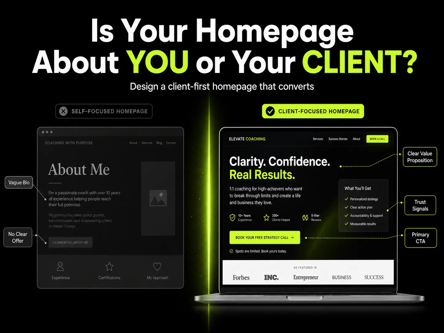
The first section needs to be much clearer than most coaches think
The top of the homepage is where many websites lose people.
A visitor should not need to scroll, think hard, or read five paragraphs to understand what you do.
They should quickly understand three things:
- Who do you help?
- What problem do you help them with?
- What kind of outcome are they moving toward?
A weak headline usually sounds like this:
“I help you unlock your full potential.”
That sounds nice, but it is too broad. Almost any coach could say it.
A stronger version would be:
“I help overwhelmed founders rebuild focus, structure, and decision confidence without adding more pressure to their week.”
That is better because it gives the visitor something real to hold onto.
It tells them who the work is for.
It names the pain.
It gives a direction.
This does not mean every sentence has to be clever. In fact, the best coaching websites usually sound simple. The visitor should not be impressed by the wording. They should feel understood by it.
Your story matters, but it should not do all the heavy lifting
A lot of coaches lead with their personal story.
That is understandable.
Your story explains why you care. It shows your values. It gives people a reason to connect with you.
But the visitor usually arrives with their own problem at the front of their mind.
If the homepage starts too much with your journey, your philosophy, your mission, and your background, the visitor may not see themselves quickly enough.
A better approach is to start with the client’s current reality.
- Talk about what they are struggling with.
- Talk about the patterns they recognise.
- Talk about the gap between where they are and where they want to be.
Then bring in your story later, once they already feel that you understand the problem.
Your about page can still be personal. It should be. But even there, the story should connect back to the client.
The reader should not just think, “This person has had an interesting journey.”
They should think, “This person understands the kind of change I am trying to make.”
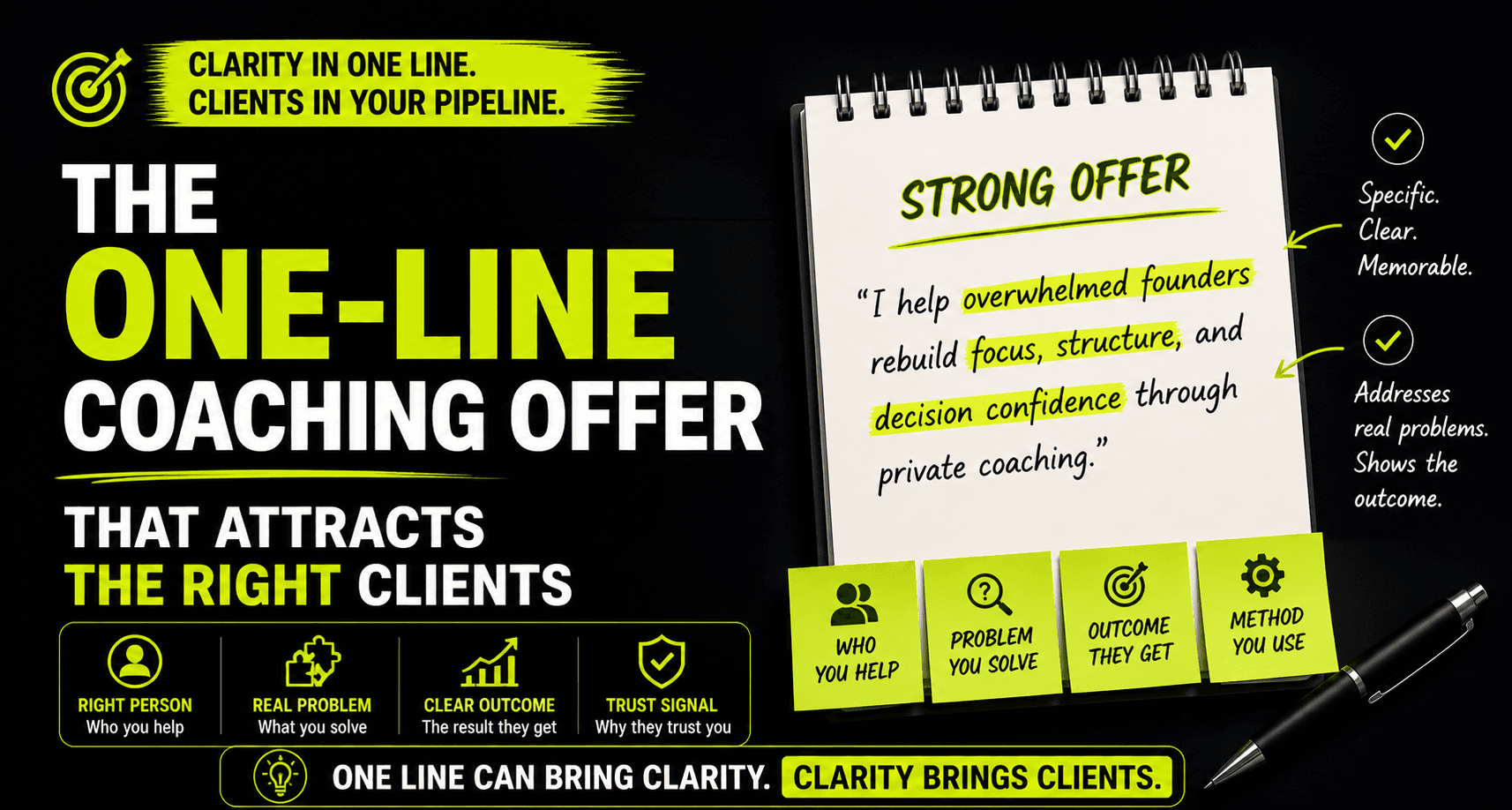
The offer needs to be easy to repeat
Here is a simple test.
Could someone read your website and explain your offer to a friend in one sentence?
If not, the offer is probably too vague.
Many coaching websites use words like:
- Transformation.
- Growth.
- Purpose.
- Potential.
- Alignment.
- Empowerment.
- Breakthrough.
These words are not bad, but they become weak when they are not connected to a specific problem or audience.
A clearer offer sounds more like this:
“I help senior professionals rebuild energy, structure, and personal discipline through private coaching.”
Or:
“I help business owners who feel stuck simplify their priorities and make better decisions with more confidence.”
Or:
“I help high-performing men get their health, habits, and personal standards back under control.”
None of these are perfect for every coach, but they are easier to understand.
That is the point.
People do not buy what they cannot explain to themselves.
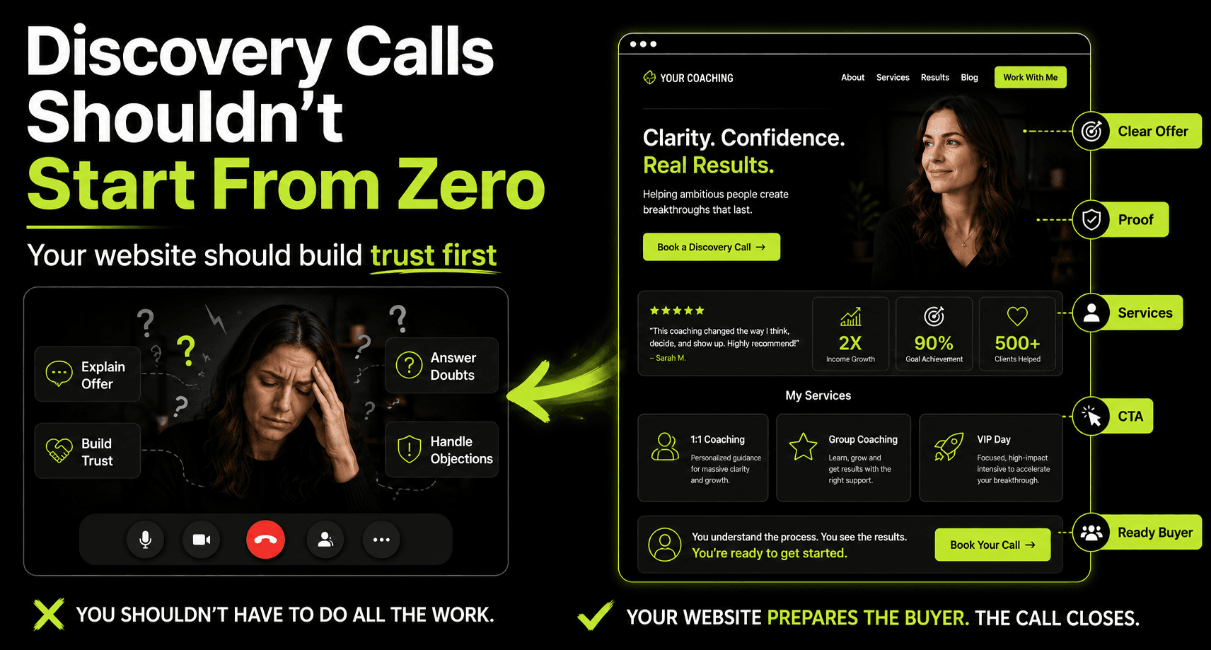
Proof should be specific, not decorative
Most coaching websites include testimonials, but many of them are too soft to be useful.
Something like this does not say enough:
“Working with Sarah was amazing. I highly recommend her.”
It is kind, but it does not help the next person understand what changed.
A more useful testimonial would sound like this:
“Before coaching, I was constantly reacting to everyone else’s priorities. After a few weeks, I had a clearer weekly structure, stronger boundaries, and more confidence in how I handled difficult conversations at work.”
That kind of testimonial is stronger because it shows a before and after.
It gives context.
It tells the reader what problem the client had and what improved.
For coaching, this matters because the work can feel intangible from the outside. You are not selling a simple product with obvious features. You are selling support, thinking, accountability, structure, and change.
So the proof needs to make the invisible parts more visible.
Use testimonials that mention:
- The problem before coaching.
- The reason they reached out.
- What the coaching helped them change.
- What felt different after the work.
You do not always need numbers. You need believable detail.
Case studies can make the website feel much more real
A short case study can often do more than a long list of testimonials.
It does not need to be dramatic. It just needs to be clear.
For example:
A founder came to coaching because everything in the business depended on them. They were working late, making rushed decisions, and constantly switching between urgent problems. The work started by simplifying their weekly priorities and creating a better decision rhythm. Over time, they became less reactive, delegated more clearly, and felt more in control of their role.
That short story helps a visitor imagine the work.
- They can see the starting point.
- They can see the process.
- They can see the outcome.
That is what generic copy cannot do.
If privacy is a concern, you can anonymise the client. You can remove names, industries, or sensitive details. But keep the situation real enough that the reader can understand the transformation.
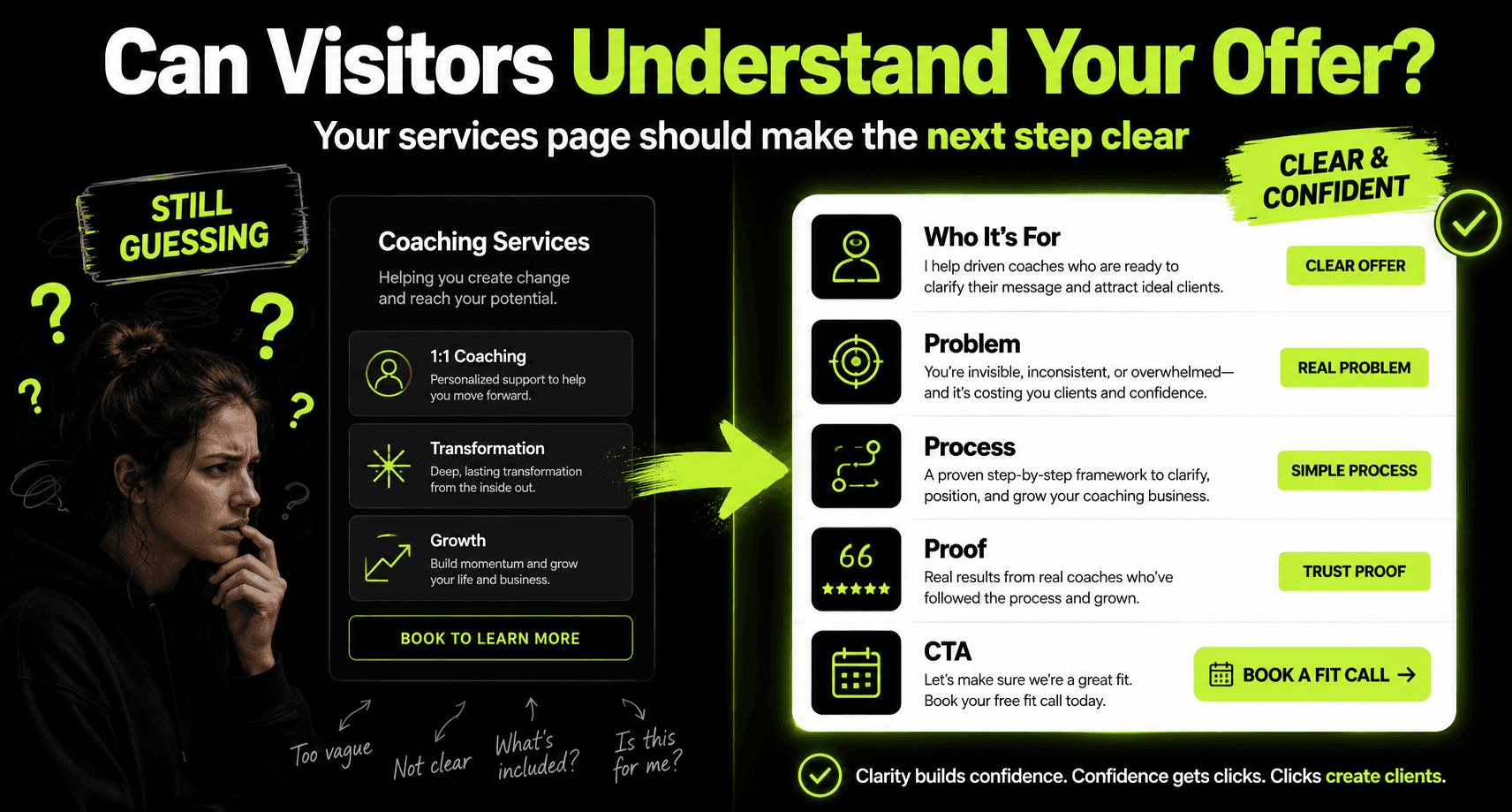
Your services page should not just list packages
A services page should help people decide whether they are in the right place.
Too many coaching websites say something like:
“1:1 coaching available. Book a call to learn more.”
That is not enough.
Before booking, people usually want to know:
- What kind of person is this for?
- What problems do you usually work on?
- How long does the process last?
- What happens during the coaching?
- Is this structured or flexible?
- What should someone expect before they book?
- Who is not a good fit?
You do not need to explain every tiny detail. But you do need to remove enough uncertainty.
The goal of the services page is not only to sell the offer.
It should also filter the wrong people out.
When your services page is clear, the people who book calls arrive with a better context. The conversation becomes easier because they already understand the shape of the work.
That saves time for both sides.
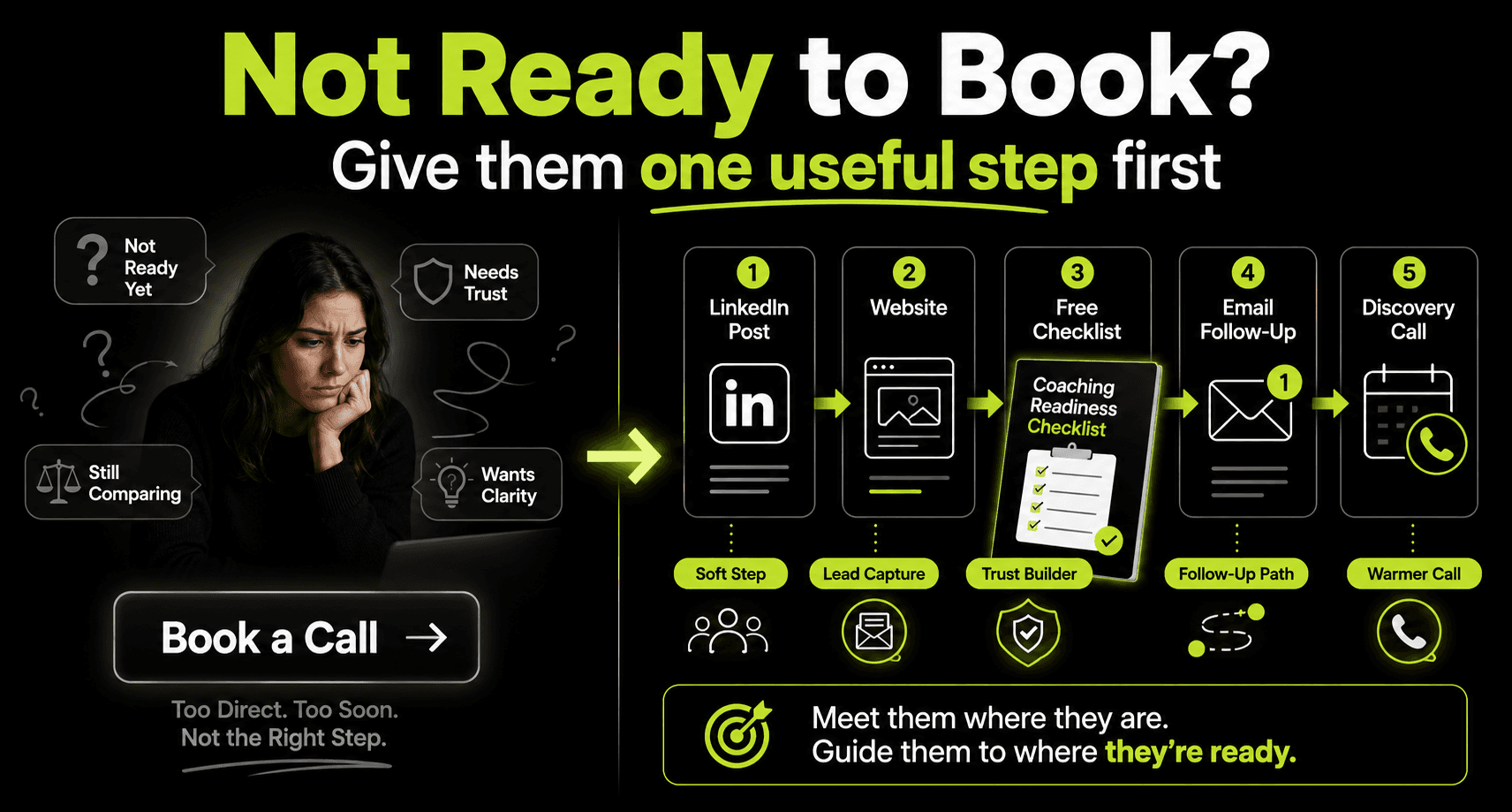
The call to action should match the visitor’s readiness
Not everyone who visits your website is ready to book a call.
Some people are just discovering you.
Some are comparing options.
Some like your content but are not ready to speak yet.
Some need to understand your method before they share their situation with you.
If the only option is “Book a Call,” you may lose people who could become good leads later.
A better website gives two paths.
One for people who are ready now.
One for people who need more trust first.
The ready-now path can be:
Book a discovery call.
Apply for coaching.
Schedule a consultation.
The softer path can be:
Download a checklist.
Take a short assessment.
Read a guide.
Join the email list.
Watch a short training.
This matters because coaching decisions often take time.
Someone may not book today. But if your website gives them a useful next step, they stay connected to your world.
That is better than losing them completely.
LinkedIn should not send people to a weaker version of your message
Many coaches are putting real effort into LinkedIn.
They are posting better content, sharing ideas, telling stories, and building authority.
But then someone clicks through to their website and the message becomes generic.
That is a problem.
Your LinkedIn content may talk about real issues like burnout, leadership pressure, confidence, discipline, decision-making, identity, health, or personal standards.
Then your website says:
“Helping you become your best self.”
The energy drops.
The specificity disappears.
The visitor feels the gap.
Your website should feel like a continuation of the same conversation.
If your LinkedIn posts are sharp and specific, your website should be sharp and specific too.
If your content speaks to executives, founders, parents, athletes, or high-performing professionals, your website should make that clear.
Attention from content is useful. But attention without a clear path usually disappears.
A simple website check for coaches
Before you redesign anything, go through your website and ask these questions.
- Can a new visitor tell who you help within the first few seconds?
- Can they understand the main problem you solve?
- Is your offer specific enough to repeat in one sentence?
- Does your homepage talk about the client before it talks too much about you?
- Do your testimonials show real change, or do they only say nice things?
- Can someone understand your coaching process before booking a call?
- Does your services page help people decide if they are a fit?
- Do you have a softer next step for people who are not ready to book?
- Is your contact or booking path easy to find?
- Does your website match the topics you talk about on LinkedIn?
If the answer is no to several of these, your website may not need a complete redesign.
It may need a clearer message and a better path.
Final thoughts
A coaching website does not need to be complicated.
It does not need fancy animations.
It does not need ten pages.
It does not need to sound like every other coach online.
It needs to make the right person feel understood.
It needs to explain the offer clearly.
It needs to show enough proof.
It needs to make the next step feel simple.
That is what turns a coaching website from a static online profile into something useful for client growth.
The best coaching websites do not try to impress everyone.
They help the right person feel confident enough to move forward.
And that is the real work.
If your coaching website gets visitors but does not bring enough serious enquiries, 100XLift can help you review the weak points.
We look at your homepage, offer, proof, services page, and call-to-action path so you can see where potential clients may be dropping off before they ever book a call.
FAQ
What should a coaching website include?
A coaching website should include a clear homepage, a specific offer, an about page, a services page, testimonials, case studies, a clear coaching process, FAQs, and an easy way to book a call or take a smaller next step.
Why is my coaching website not getting clients?
Your website may not be getting clients because the message is too broad, the offer is unclear, the proof is weak, or the visitor does not know what to do next. In many cases, the issue is not traffic. It is unclear positioning.
How can coaches make their website more trustworthy?
Coaches can build trust by using specific testimonials, short case studies, clear process explanations, credentials, helpful FAQs, and honest copy that speaks directly to the client’s real situation.
Should a coach have a blog?
Yes, a blog can help if it answers the questions your ideal clients already have. A coaching blog should not be random content. It should support your positioning, explain your approach, and help visitors trust your thinking.
What is the best call to action for a coaching website?
The main call to action is usually a discovery call or consultation. But it also helps to offer a smaller step, such as a checklist, guide, quiz, or email resource for visitors who are interested but not ready to book yet.